Approach:
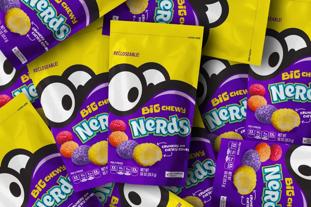
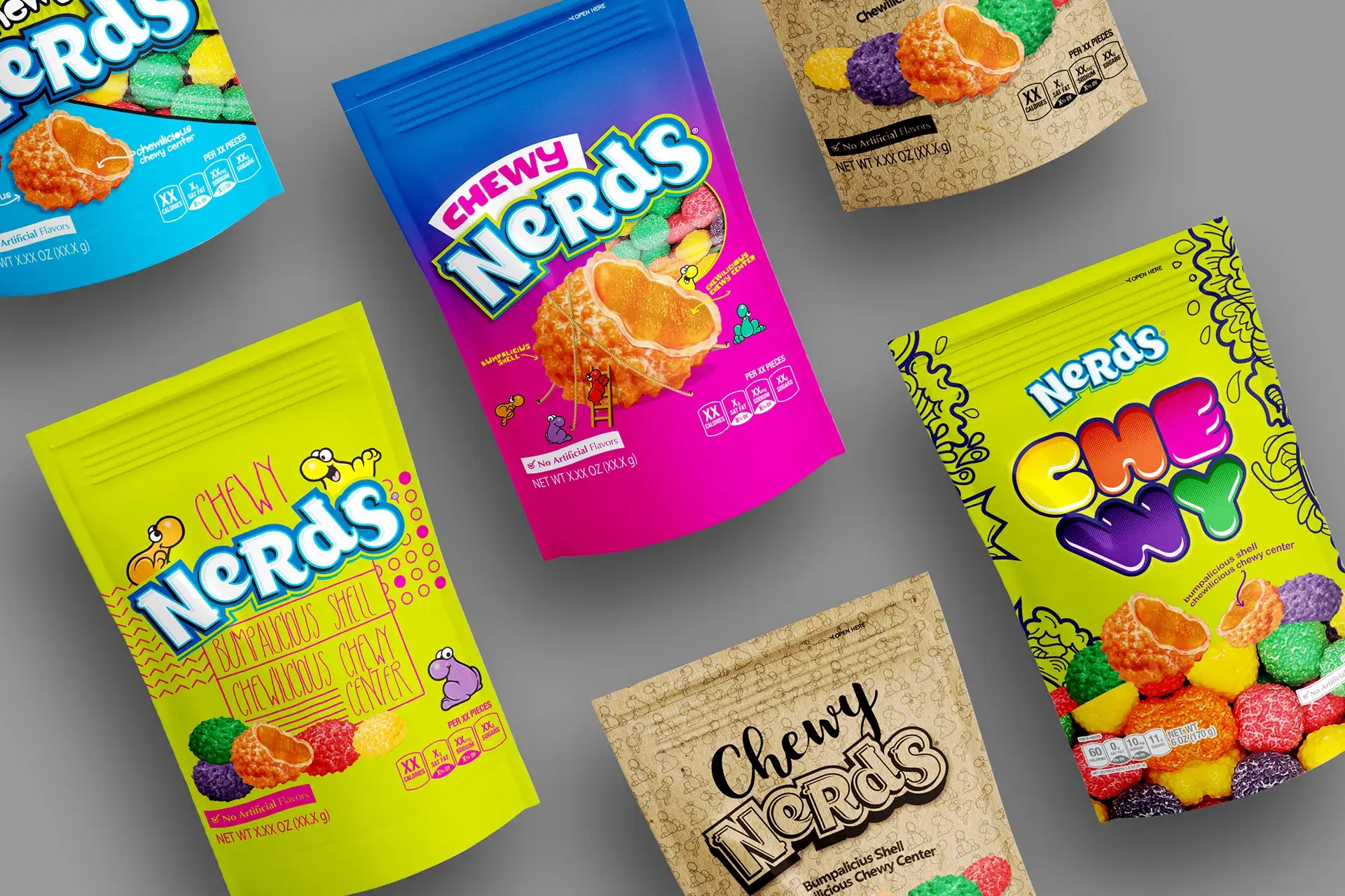
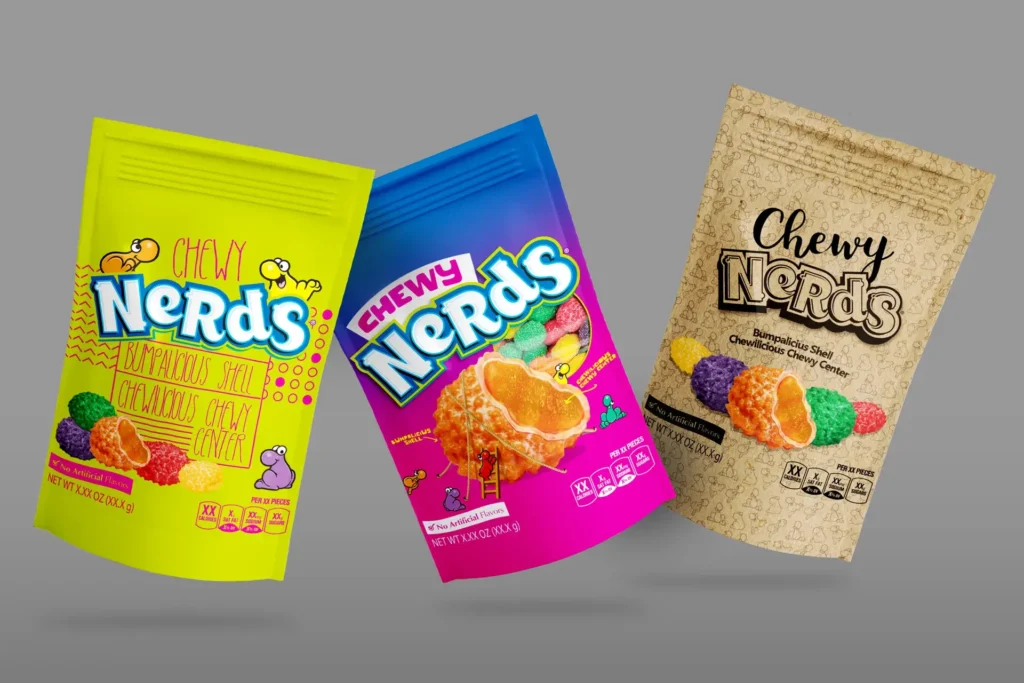
Through deep research and analysis of competitor packaging, the team saw an opportunity to be disruptive. The goal was to create a packaging design that broke the mold—something that would immediately draw attention and emotionally connect with younger shoppers. To achieve this, the team decided to break traditional Nerds brand guidelines by taking a bold, artistic leap.
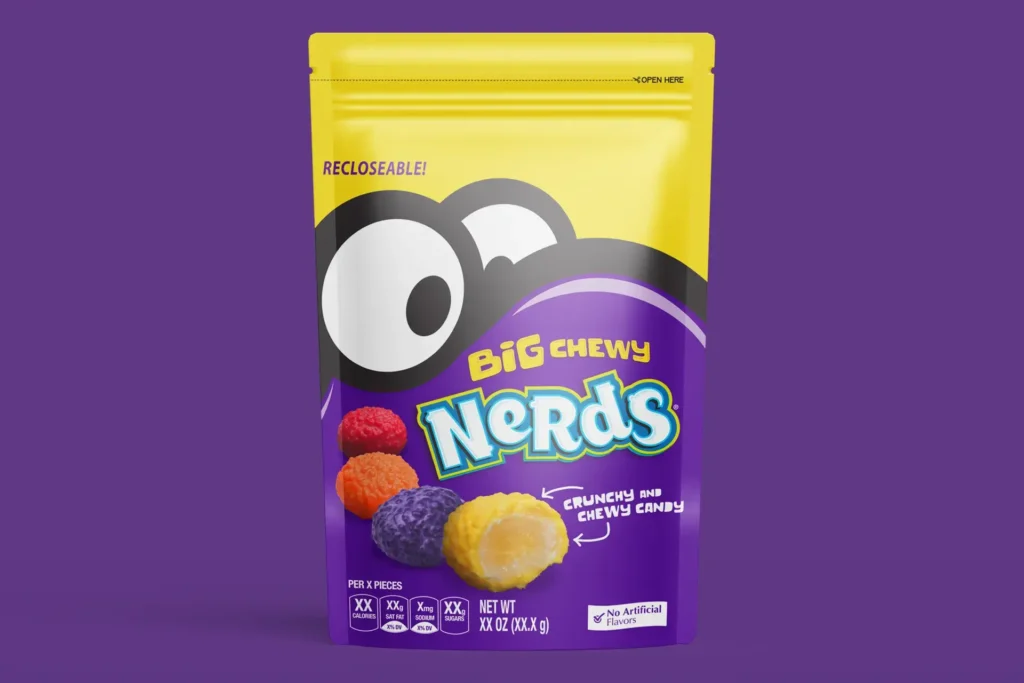
Macro closeups of the iconic Nerds characters were used, dialing up their energetic, quirky personalities to make them larger-than-life. This visual strategy amplified the nostalgic element of the brand while also evolving it to resonate with a more youthful and digitally native audience. The intention was to make the product stand out from the typical candy aisle clutter by offering a fun and fresh perspective.
Solution:
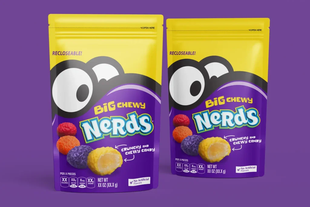
The final packaging solution leveraged vibrant, eye-catching colors and dynamic character illustrations that took center stage. The new design prominently featured close-ups of the Nerds characters, allowing their playful expressions and attitudes to shine through. This decision created a strong emotional connection with consumers right from the first glance, making it nearly impossible to ignore on the shelf.
By making the packaging resealable, we also added a functional benefit that spoke to the modern consumer’s need for convenience. The final design conveyed both nostalgia and innovation, perfectly blending the essence of the Nerds brand with a fresh and engaging visual twist.
Outcome:
The new packaging delivered on every front. Despite having no advertising budget, the Big Chewy Nerds product achieved significant sales growth soon after the launch. The redesign not only resonated with the target audience but also helped elevate the overall perception of the brand.
Additionally, the packaging design was recognized within the industry, receiving an award for its innovative approach. The reimagined look has now become an iconic part of the Nerds brand, reinforcing Ferrara’s position as a leader in the candy category.
