Approach:
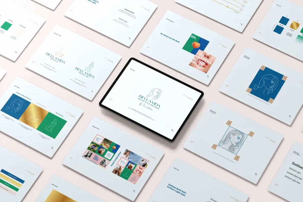
With an emphasis on originality and authenticity, our approach was to replace the generic clipart with a custom illustration that personified the founder and the brand’s bespoke services. We aimed to maintain a visual language that could be adapted across different service verticals while retaining a clear and cohesive identity.


Solution:
The new branding suite included:
- Main Logo: A bespoke illustration of the founder’s profile, lending a personal and exclusive feel to the brand, enhanced by a refined typographic treatment.
- Instant BBL Service Logo: A stylized figure with a heart motif captures the essence of the signature service while aligning with the main brand aesthetics.
- Institute Service Logo: A delicate hand and heart design that symbolizes the caring and educational approach of the brand’s wellness philosophy.
Each logo maintains the elegance and sophistication necessary for a luxury brand, with a consistent style and color scheme that ties the service verticals back to the central brand identity.

Outcome:
The branding and digital strategy for Monkey Grip led to:
- A strong and appealing brand identity that effectively communicates the product’s unique value proposition to its target audiences.
- Increased website traffic and user engagement, with positive feedback on the ease of use and the quality of the apparel.
- Enhanced brand recognition among fitness enthusiasts and athletes, establishing Monkey Grip as a key player in the Crossfit apparel market and driving significant sales growth.
Through meticulous branding and user-centric web development, Monkey Grip has redefined the Crossfit apparel market, turning every workout into an opportunity for enhanced performance and style. This strategic approach not only elevated the brand’s market position but also demonstrated the power of combining fitness, durability, and UX/UI design to create meaningful connections and experiences.
